
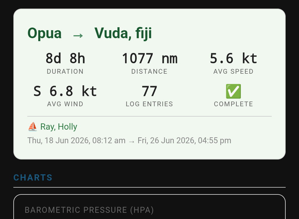
Holly and I departed New Zealand in mid-June for our 8 day offshore passage to Fiji. Before we left, we built a digital passage management system to complement our paper logbook and along the way, the project turned into something more interesting than a logging tool. It became a case study in a question every offshore sailor relying on automation should ask: when a safety system says “sent,” how do you actually know it’s telling the truth?
The Problem
If you’ve done offshore passages, you know the watch routine. Every hour or so, the person on watch walks the boat, checks equipment, looks at the horizon, glances at the instruments, and writes a line in the logbook. Time, position, course, speed, wind, barometer, sea state, battery voltage, fuel level. We’ve always used a bound paper logbook for this, and we still do, it’s the legal backup, the thing that works when everything else has gone sideways.
But paper has limits. You can’t search it, graph it, or have it auto-populate from instruments at 02:00 when it's dark and you’re tired. We wanted a digital system that complements the paper log, same data, pulled from the sensors we already have flowing through Home Assistant and Signalk, presented in a way that’s actually useful.
That system grew to include something else entirely, automated daily welfare reporting to Passage Guardian, the free vessel-tracking safety service we use on ocean passages. And that’s where the real lesson of this build emerged...
What We Built: The Passage Dashboard
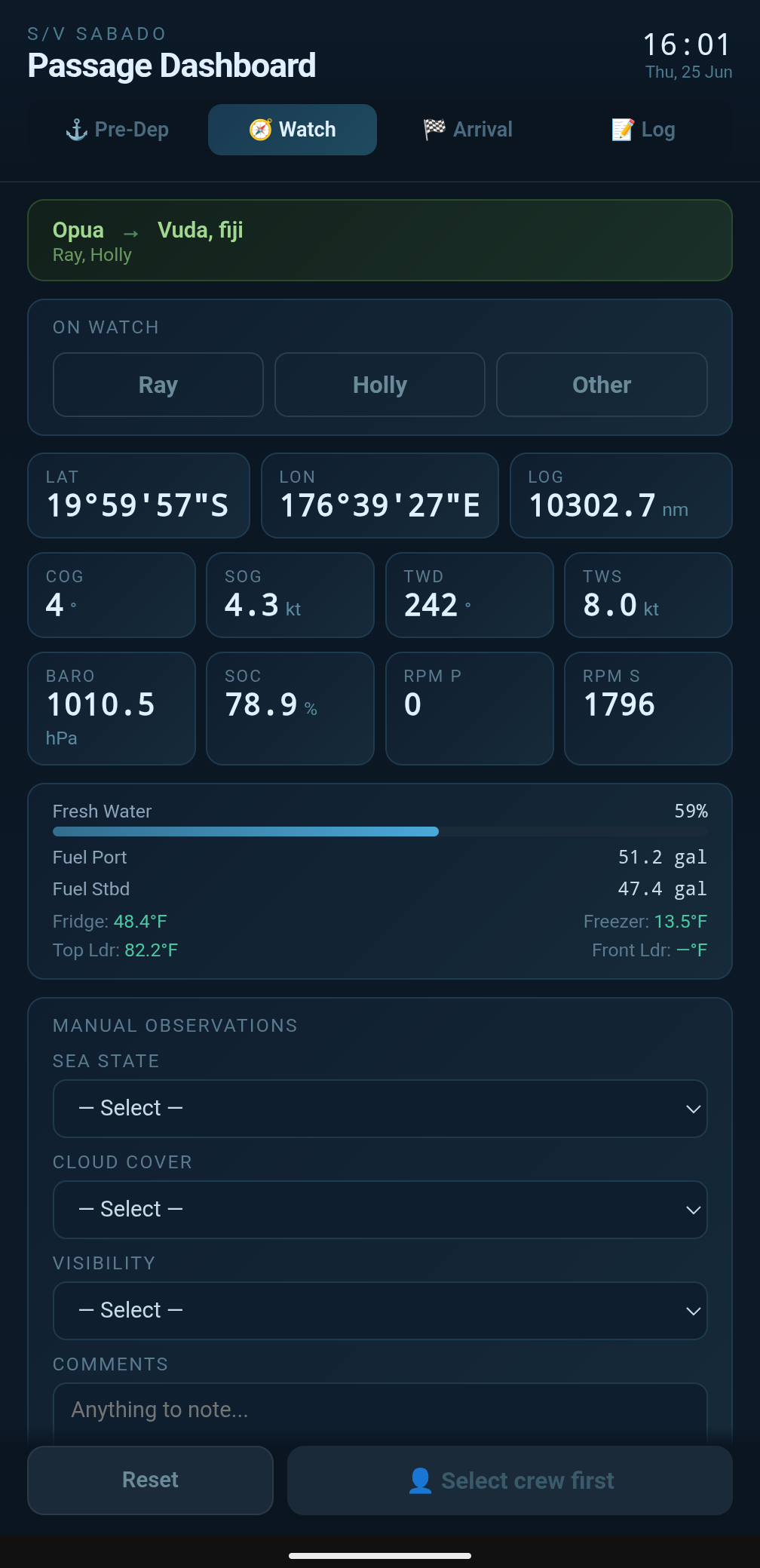
The Passage Dashboard is a custom Home Assistant panel, vanilla JavaScript, no frameworks, running in Home Assistant's sidebar. It manages pre-departure checklists, hourly watch logging, daily safety reporting, and arrival procedures.
Live Instruments
The Watch tab shows position (degrees, minutes, seconds), course and speed over ground, true wind direction and speed pulled directly from our wind instrument’s MWD sentence, barometric pressure, trip log distance, battery state of charge, and engine RPM for both engines, side by side, so a developing problem on one engine is visible at a glance. Below that: fuel and water gauges, and all four refrigeration zones in °F.
Sea state, cloud cover, and visibility are manual dropdown selections, since there’s no sensor for “what does the sky actually look like.” We added a “Night” option to both cloud cover and visibility, an obvious omission once we hit our first overnight watch and realized there was no honest way to log “can’t see clouds, it’s pitch black.”
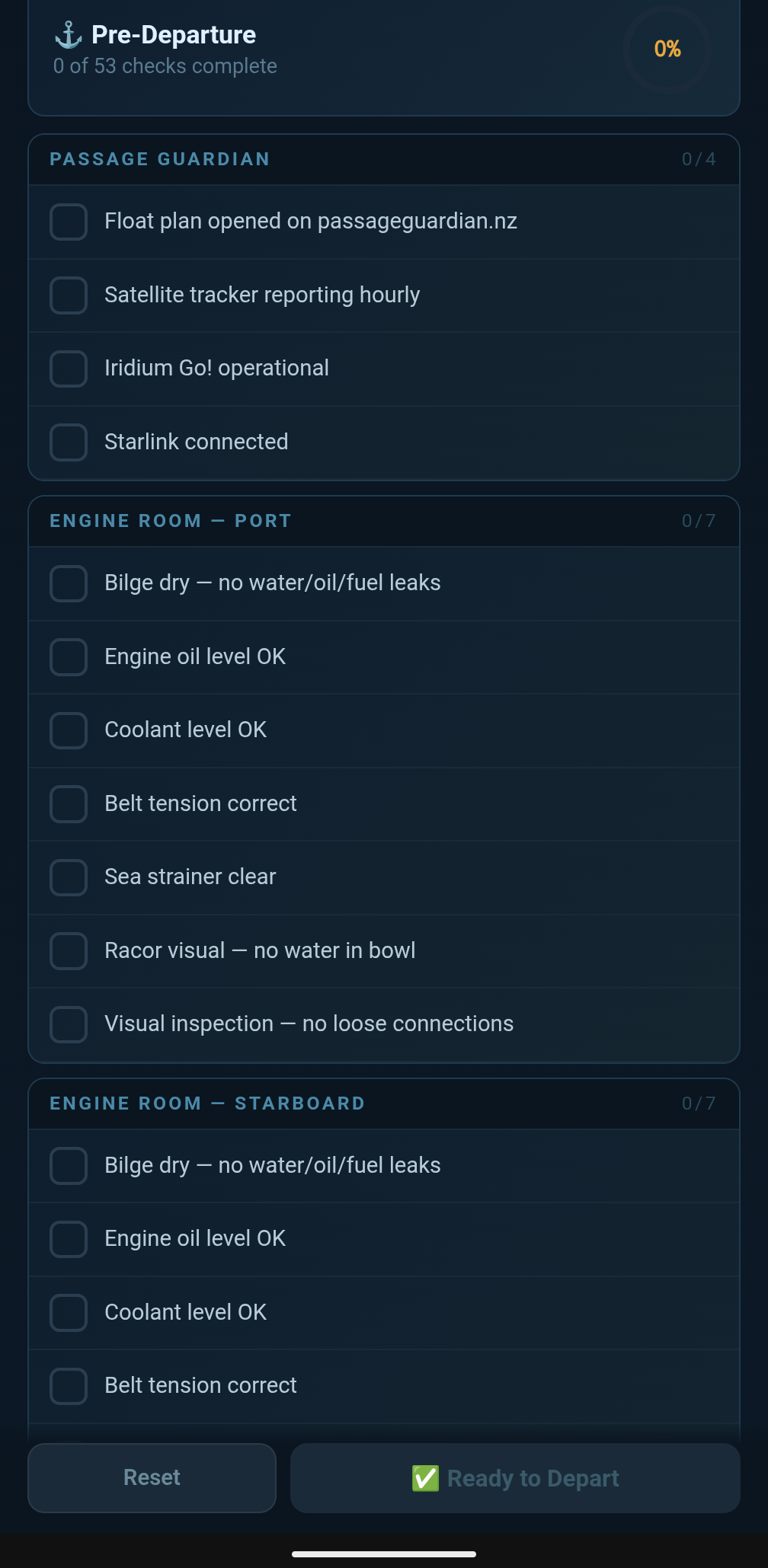
Pre-Departure and Arrival Checklists
Eight sections cover everything from engine room inspections (duplicated for each hull, because catamaran life means doing everything twice) to safety gear to comms checks. Sensor-backed items show live values automatically; everything else is a tappable checkbox. The “Ready to Depart” button only goes green when every item is checked.
The Real Story: Verified Safety Reporting
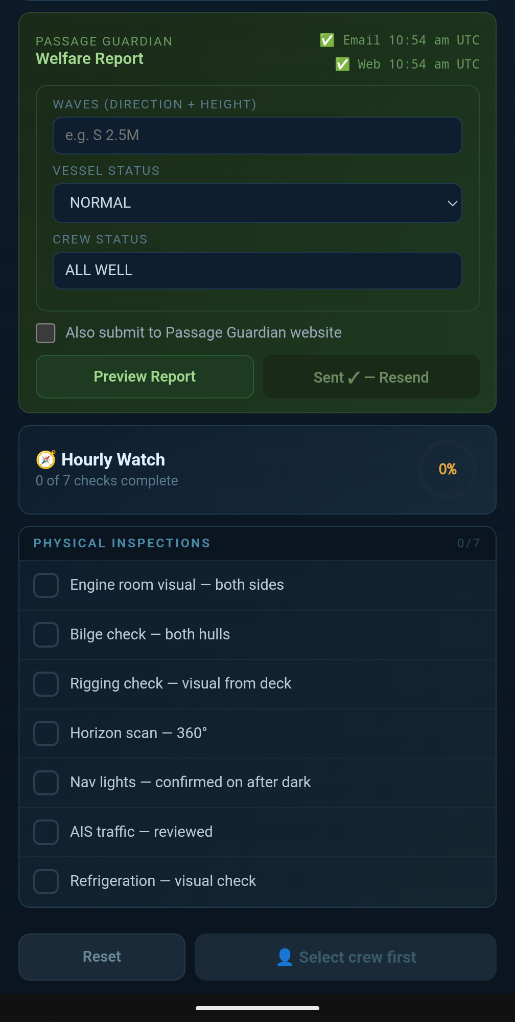
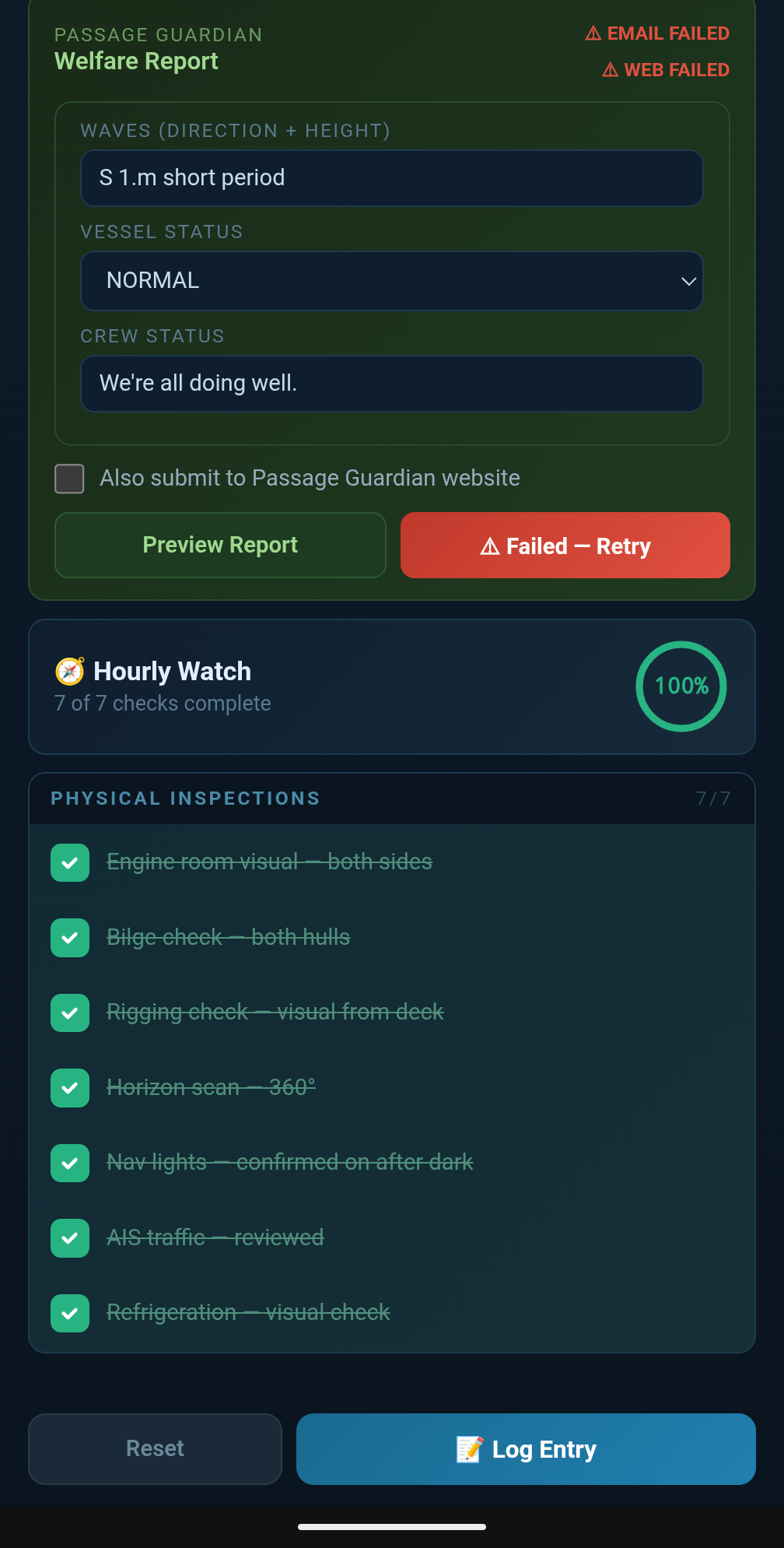
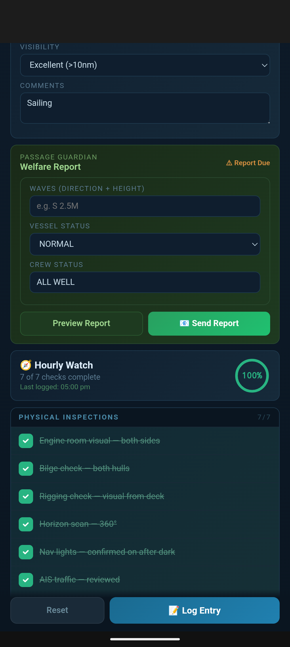
Here’s where the project got serious. We use Passage Guardian for vessel tracking on ocean passages. You submit a daily welfare report (position, conditions, vessel and crew status), and if a report is missed, they assess risk and can contact the relevant Rescue Coordination Center. We built the dashboard to generate that report automatically, formatted correctly, with one tap. It still requires us to, and this is very important, send the report manually by populated certain fields ourselves and pushing the send button.
The first version worked exactly as you’d expect: tap Send, the dashboard fires the email through Home Assistant’s notify service, marks the report as sent, and shows a green checkmark. Clean, simple, done.
Except it wasn’t telling the truth.
The Bug That Mattered
One day, with Starlink briefly down, I tapped Send. The dashboard showed green: “Sent.” The email had not gone anywhere. Home Assistant’s notify service is fire-and-forget it returns as soon as the request is made, not when the email actually leaves the boat. The SMTP failure happened silently in the background, and the dashboard had no idea anything had gone wrong. It had already marked the report as delivered and logged it to our database as a confirmed send.
Think about what that means in practice. You’re offshore, you send your daily report, the dashboard says green, you move on with your watch. Passage Guardian never receives it. You don’t know. They don’t know there’s a problem until a report goes missing for long enough to raise concern except from your side, every report looks like it went out fine. That’s not a logging bug. That’s a safety system actively lying to the person relying on it, which is worse than having no automation at all.
We pulled the actual Home Assistant error log from that day and found it: socket.gaierror: [Errno -3] Try again a DNS resolution failure, because there was no internet to look up the mail server’s address. A completely mundane, expected failure on a boat. And the dashboard had papered right over it.
Building Something That Doesn’t Lie
The fix was to stop trusting the request and start verifying the result. We wrote a small Python script using only the standard library (no internet-dependent package installs needed on Home Assistant’s locked-down OS) that does the actual SMTP send itself, using smtplib directly instead of going through Home Assistant’s notify abstraction. Critically: it only writes a “sent” record to our database after the mail server has actually accepted the message. If the send fails for any reason no DNS, no connection, timeout, authentication failure the script reports failure and writes nothing.
The dashboard now shows “Sending…” the moment you tap the button, then polls the database for up to thirty seconds looking for that confirmation record. Only when it finds one does the status flip to a genuine green “Sent.” If nothing shows up, the button turns red — “Failed — Retry” — and both phones on board get a push notification. No silent failures. No false confidence.
We tested this rigorously before trusting it. The next time we were running with Starlink off for an extended stretch, we sent the report deliberately to watch it fail and it failed exactly as designed: red status, phone notification, nothing logged. No retry happens automatically either, which was a deliberate choice. A background retry loop quietly hammering away while you’re unaware there’s a connectivity problem is its own kind of false comfort. We wanted a human to notice the failure and decide what to do next wait for better signal, try again, switch to another method rather than software pretending to handle a problem it can’t actually solve.
Two Independent Channels
Passage Guardian accepts reports by email or web form, and we wanted both available but they serve different purposes for us. The email goes to our designated shore contact and copies our own address, so it’s always part of the loop regardless of which safety service we’re using on a given passage. The web form submission goes specifically to Passage Guardian’s tracking system, and we only want it firing when we’re actually using their service that trip.
So the email sends every time, automatically. A separate tick box “Also submit to Passage Guardian website” defaults off and resets off after every send. Tick it, and the same tap also submits the structured report through Passage Guardian’s web form. Leave it unticked, and only our shore contact gets the email, which is useful on passages where we’re not engaging Passage Guardian’s service at all.
The web submission needed its own verification problem solved. Their form runs on a session-authenticated system: log in, grab a fresh form token, submit, and the only real proof of success is a server-issued acknowledgement page confirming receipt. So the script logs in, submits, and explicitly checks for that acknowledgement text before reporting success same philosophy as the email fix, applied to a more involved process. It writes its own confirmation record only when it sees genuine proof of receipt, completely independent of whether the email succeeded.
The result is two honest, independent status lines on the the dashboard: Email and Web, each showing its own Sending/Sent/Failed state, each confirmed against our database rather than assumed. One can succeed while the other fails, and you’ll know exactly which is which.
Getting the Format Right for Two Audiences
The report needed to read two different ways. For the email going to a human, our shore contact, who’s reading it on a phone we wanted it genuinely easy to parse: proper degree and minute symbols on the coordinates, wind direction as a compass point instead of a raw heading number, “True” spelled out on course over ground. For the web form, Passage Guardian’s own system expects a terser, more standardized format: padded three-digit headings, plain spaced coordinates, compass abbreviations without the niceties.
Rather than maintain two separate formatting paths that could drift out of sync, the dashboard computes the underlying data once position, course, wind, conditions and derives both presentations from that single source. The wind-to-compass-point conversion lives in one shared function so the email’s “SW” and the web form’s “SW” are always guaranteed to agree. There’s also a calm-wind threshold: below about three knots, the compass direction is essentially meaningless noise, so both formats show “Variable” (or “VRB” on the web form) instead of a misleading heading.
What We Learned
The watch dashboard, the checklists, the live instruments all useful, all working well. But the part of this project that actually mattered was the verification work on the safety reporting. It would have been easy to ship the first version, the one that showed green regardless of whether the email actually left the boat, and never know it was wrong until the day it mattered.
The principle that came out of this: a safety system’s status should reflect confirmed reality, not attempted action. Calling an API, firing a service, sending a request none of that is the same as the thing actually happening. If your dashboard can’t tell the difference, it’s not protecting you; it’s giving you a reason to stop checking.
We’ve carried that principle through the rest of the build. Every status indicator on this dashboard battery state, watch completion, both report channels is built to show what’s verifiably true, not what was merely attempted. When something fails, it says so, clearly, and tells a human rather than trying to handle it quietly on its own.
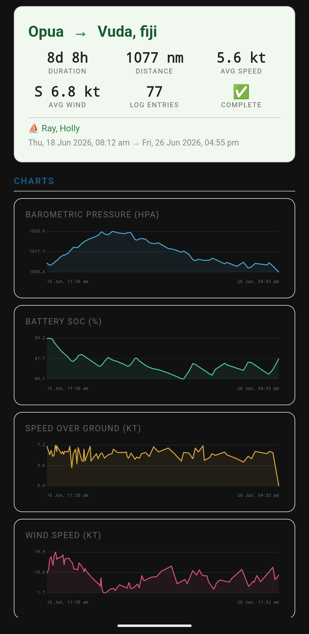
Reports
Now that we have all this data in an electronic format, pulling the data into a trip report is easy. We're just scratching the surface of what we're doing with this system and since this is our first passage with it, things are likely to be modified and tweaked as we go but for now, we really like it.
Here's the pdf version of our NZ to Fiji trip.
The paper logbook is still there, still the backup of the backup. But the digital system now earns the trust it asks for and on an ocean passage, that’s the only kind of automation worth having.
The code for this is ugly and is pretty specialized for our system but just in case you’re curious or feeling adventurous, I’ve shared the code for our Crew and VIP members here. If you use it, please let me know how it goes and perhaps we can collaborate to make it easier to adapt for other users.